
“Things my mother should never have told me”
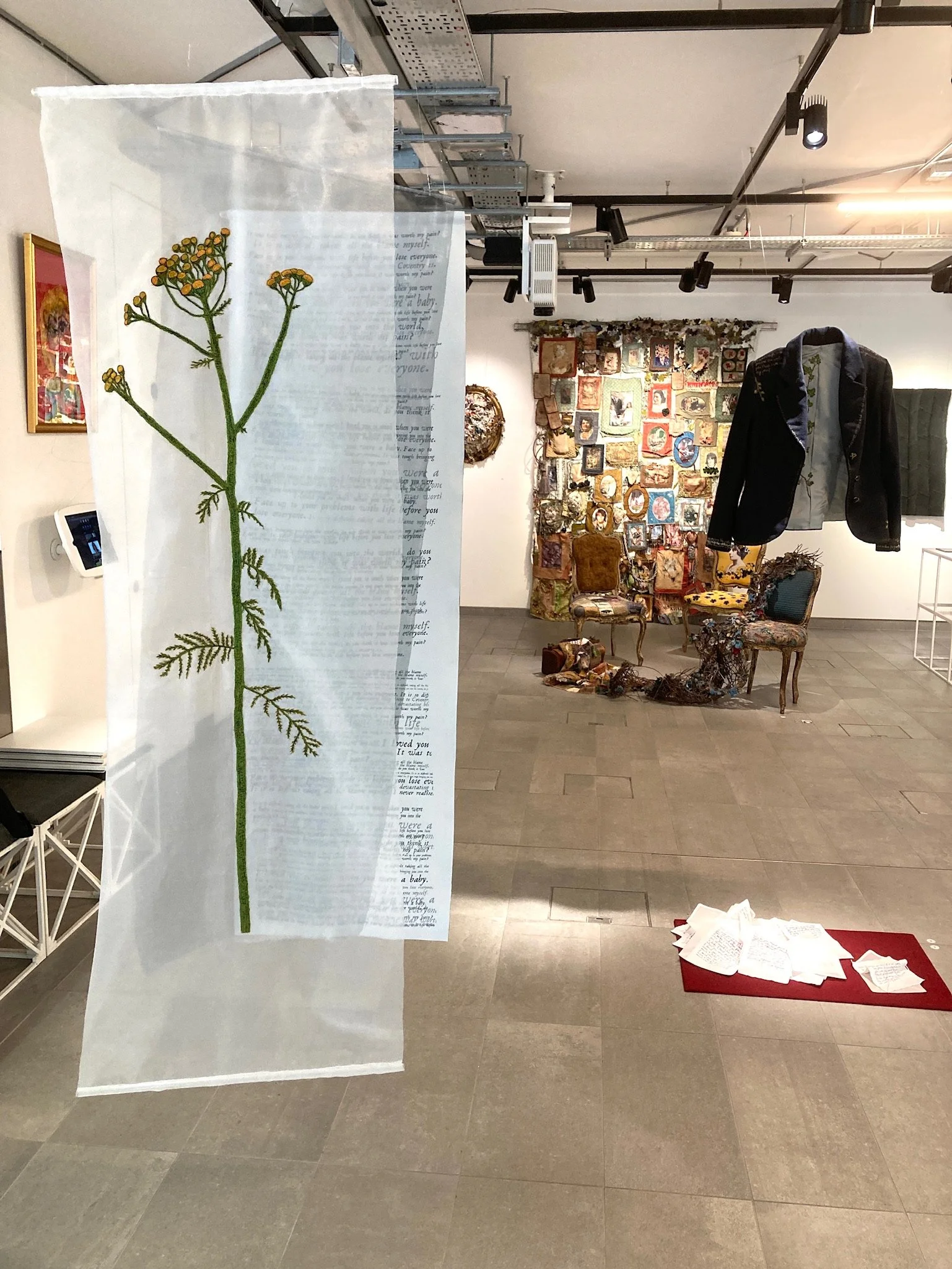
Work on display at the City Lit Gallery in London
The culmination of my recent studies at City Lit on the Advanced Textile Course was a final show in which I exhibited a body of work. The work was a radical departure from my usual subject matter, and drew on some deeply personal experiences that, until recently, I had only shared with my husband, children and a very few close friends. In this post, I will explain a bit about the background to the work, the planning and techniques that went into the making of the pieces.
A bit of background
The source material for the letters that appear in my three pieces of work with the collective title “Things my mother should never have told me” is a large number of unsolicited letters, cards and emails that I have been receiving from my mother for over ten years. They are basically hate mail and make very difficult reading. For many years I threw the letters away, deleted the emails and replied to the communications very sparingly, not wanting to get into a dialogue of any kind. I felt powerless to stop the relentless onslaught and it made me feel invisible as a person. At some point I started to keep what I had received in the post and some of the emails (they would eventually prove to be useful evidence). I placed all the material in large folders and couldn’t bear to look at any of it without feeling physically and emotionally exhausted. After a lull, I started receiving phone messages and emails again during lockdown in 2020 and eventually felt that I had no choice but to involve the police. This ended in my mother being given a caution for harassment. Up until this point I had only shared what had been happening to me with a very few people - mothers tend to have a venerated role in society and to talk honestly about your own mother in terms of abuse is not something that is easy to do. Having had the courage to ask the police for help, though, and feeling that my cry for help being taken seriously, was like a ‘validation’. It gave me enough confidence to think that perhaps a way of dealing with this experience would be to do something really creative to counteract the destructiveness of my mother’s behaviour and the years of misery that it had caused me, my husband and children.
I use the ‘source material’ (letters) in different ways in this body of work as a way of exploring the various ways that the whole experience has affected me.

The Jacket
I have suffered from chronic fatigue, anxiety and depression for many years and went to see a specialist doctor (psychologist) in London. He described anxiety as a heavy overcoat that you wear, it is not part of you, it weighs you down, but you can take it off! I found this to be a very powerful image and when I came to make the body of work the idea came back to me.
I originally planned on adding the words to an existing overcoat, but it soon became important to make my own garment and then embellish it with the words - the impact of which being like a heavy weight that you are constantly dragging around with you. I chose to decorate the outside of the jacket with hand stitched words, which are all actual phrases taken from the letters and emails. I particularly wanted to stitch them by hand - it needed to be time consuming and challenging, given the nature of the material, even though the slow process of stitching them was emotionally really challenging and released many memories from my childhood. It was also therapeutic, though, because the potency of the words diminished as I repetitively stitched the same words and phrases.
anxiety as a heavy overcoat that you wear, it is not part of you, it weighs you down, but you can take it off
In the lining of the jacket there are two underarm panels where I heat transfer printed a dye sublimation design that I created again using words from the letters. The design uses the text but this time in a graphic style with layers of overlapping text using an italic font to give it a vintage feel and feeling of time passing.
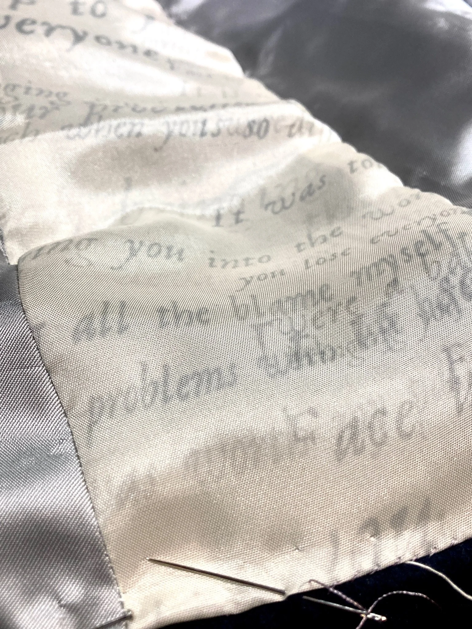
Underarm panels in the jacket lining with printed text
As well as the words, the other imagery used on the outside and inside of the jacket are plants. I have always had a feeling of tension in my work a need to create something that is beautiful, inspired by nature as a way of challenging all the nastiness that I have had to deal with over the years. At the same time, this has always felt a bit superficial and lacking depth/meaning and I have always been torn between making things that are purely decorative and wanting to and not knowing how to create work that addressed the deeply personal content that I feel I needed to. I soon realised through developing some of my ideas, that the way to do this would be to actually incorporate both the challenging themes and the natural elements in my work. I did some research on the language of flowers and the symbolism of various plants. I found out that Tansy, the yellow plant that decorates the outside of the jacket, is poisonous and was used in the middle ages to induce abortions. This seems like the perfect choice – a beautiful, statuesque plant that is also toxic and associated with getting rid of unwanted children. This really resonated for me with my mother’s actual words to me in a birthday card “it was tough bringing you into the world, do you think it was worth my pain?”.
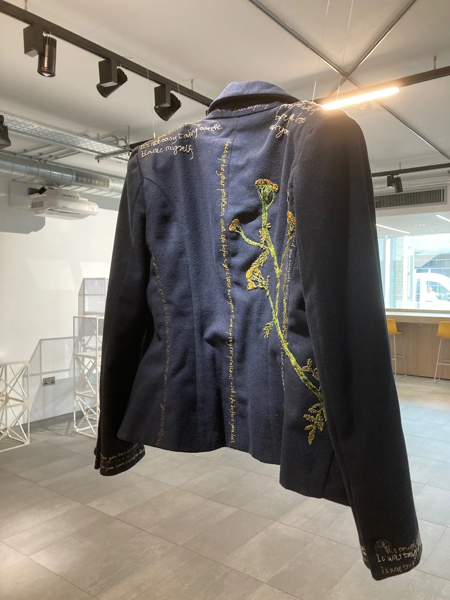
The back of the jacket showing the Tansy plant

Jacekt with handstitched words

Jacket detail
The Tansy is growing up the back of the jacket – a constant burden, along with the heavy weight of the words. Growing up the inside lining of the jacket and poking through to the outside are ivy stems. These are to symbolise a resilience and determination – not always visible on the outside, but an inner strength and myriad of coping mechanism to allow me to carry on.
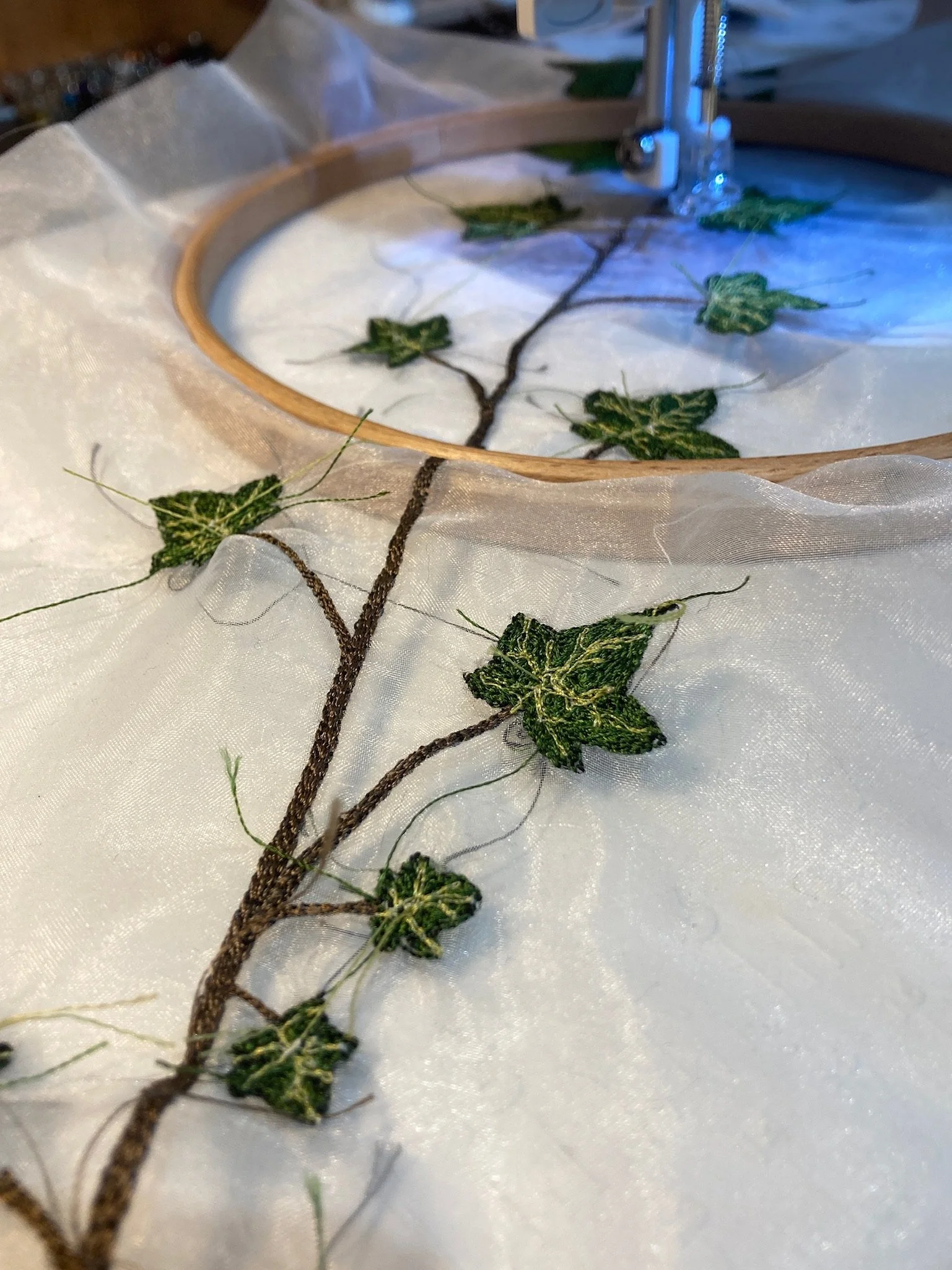
Work in progress, freemotion embroidered ivy
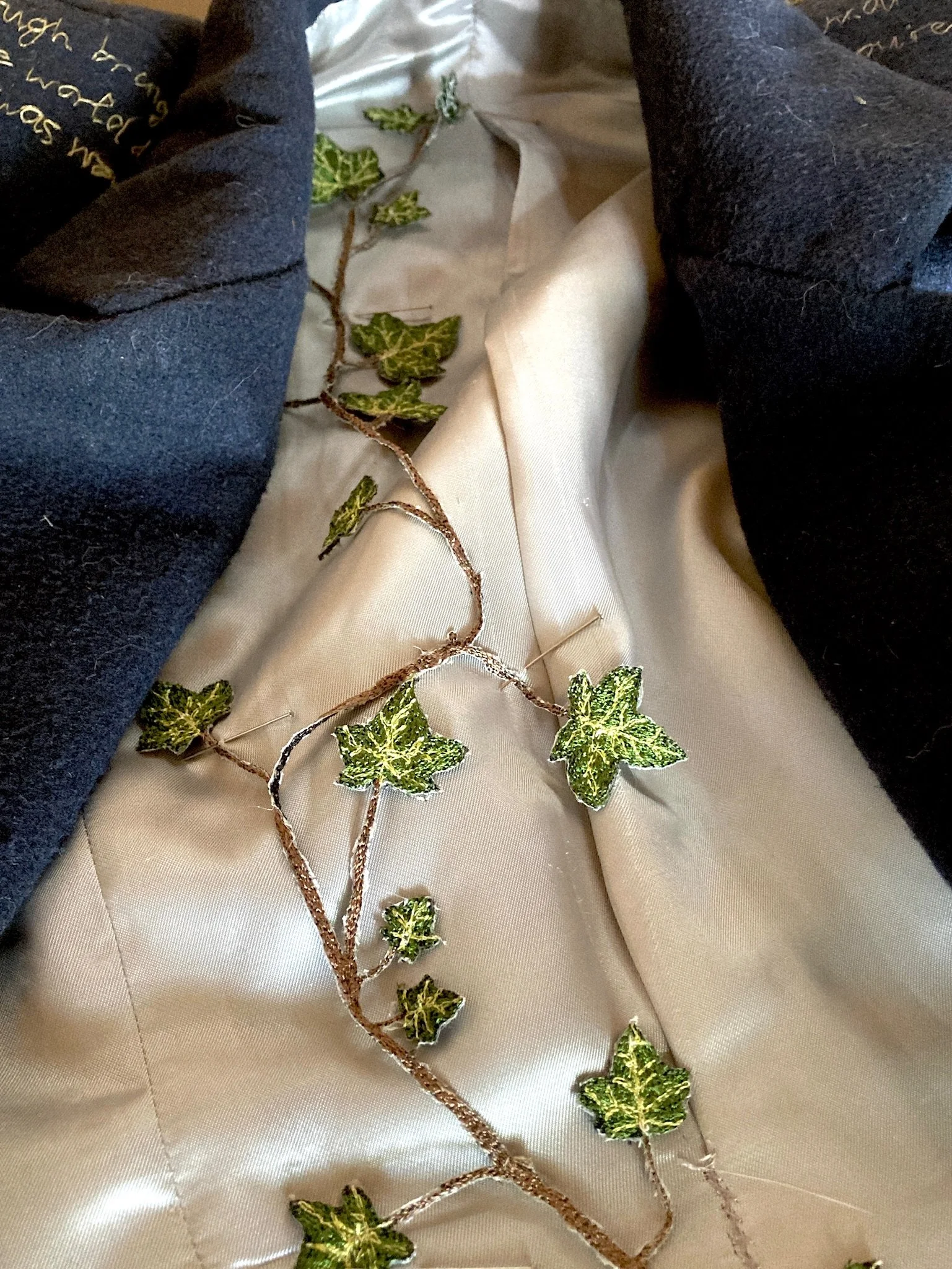
Ivy stitched in place in the jacket lining
Triptych
I use the words and plant imagery again in another piece – a triptych consisting of three panels approximately 1.5m tall and 0.5m wide. The words this time act as the ‘backdrop’ to my life, like an ever-present wallpaper that underpins and informs how I feel and behave. It is in the same style as the jacket lining and from a distance looks like a nice piece of graphic art. If you care to look closer, though, it is full of hateful words and unpleasant thoughts. The middle of the three layers is a handstitched, almost life sized, form of a woman (representing me) on translucent organza. This panel represents my feelings of invisibility and powerlessness, hidden between the outer layers. The front panel is taken up by a large version of the Tansy. This time a whole plant that has been free motion embroidered and then hand sewn with invisible thread onto a piece of organza. This represents the duplicity and deception – something that is at the same time attractive, deadly and overpowering.
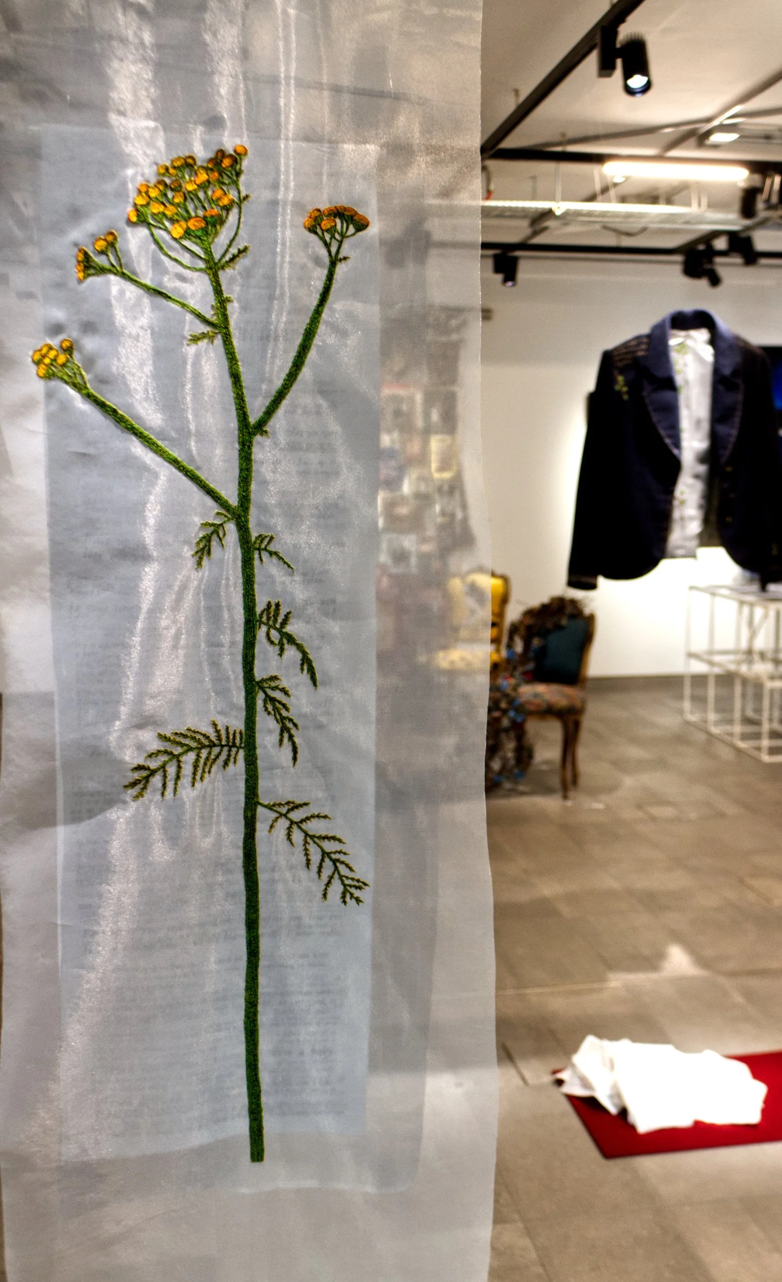
Triptych - front panel
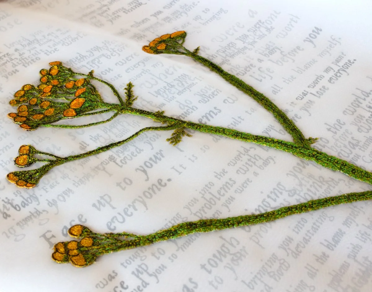
Tansy (detail)
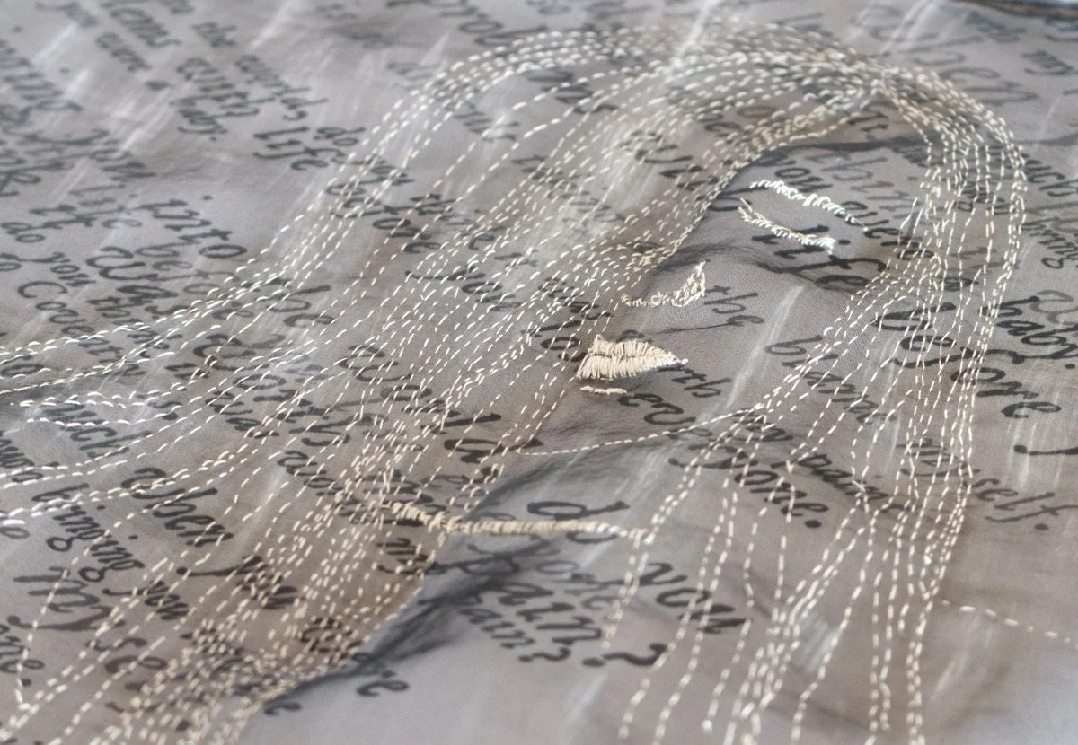
Handstitched figure on organza
Letters
The third piece is an installation made up of letters and envelopes piled up on a rectangle of red fabric to look like letters landing on a doormat (my doormat). They represent the sheer volume of material that I’ve received over the years and the dreaded feeling that I get every time I hear the postman pushing letters through the door. The fear that it might be more hate mail arriving and not knowing until the envelope was torn open whether there was something nasty inside.
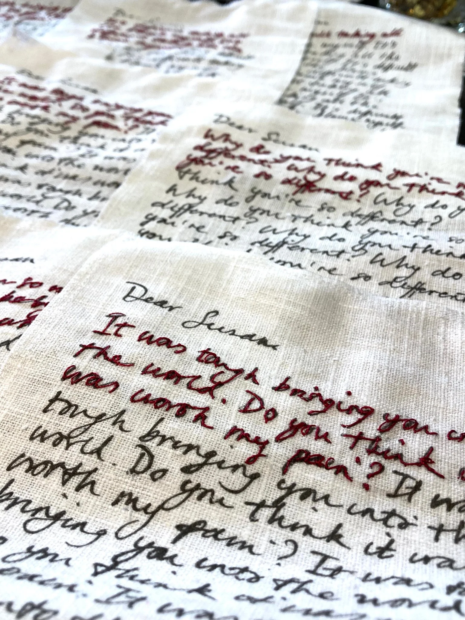
Letters - handstitch on printed linen
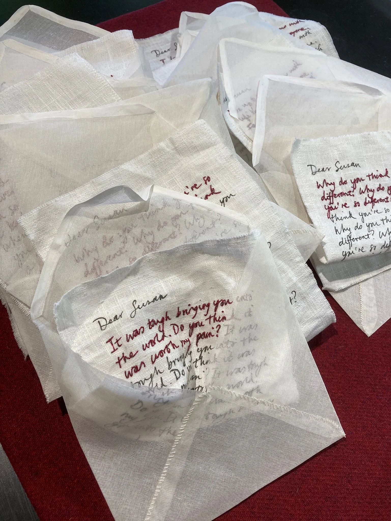
Letters and envelopes
I cut the envelopes out of white cotton organdie, which has a nice crips quality and folded and hand sewed them - they have an innocuous feeling of familiar familiarity. The fabric is not completely opaque, so you get a hint of what is inside. For the accompanying letters that go in the envelopes, I chose about 5 phrases from some of the source material. I wrote them out repeatedly on separate pieces of paper in my own handwriting and then scanned them and printed them onto white linen in black using an inkjet printer. They are a bit like the lines that a child used to do in detention – repeating the same phrase over and over again. I then hand stitched over the first sentence on each letter in red thread to emphasise the words. I folded some of the letters and placed them in the envelopes, others were screwed up and arranged to look like they had been read and discarded. From a distance, again, it looks like a series of attractive letters in nice handwriting, but if you to dare to take a closer look, they tell a very different story.
